
Applies to api_version: "2026-01", @pancake-pos/ui 2026.1.11 and later.
An iframe page (an app.page with render: "iframe") is a free-form web app: React, routers and any library work. To make it look and behave like the other POS screens, @pancake-pos/ui provides:
- The same components as Worker UI: every
pos-*element in UI components has a React component with the capitalized name (pos-table→PosTable), the same properties and events. POS draws Worker UI elements with these very components, so both kinds of pages match pixel for pixel. PosProvider: connects to POS, applies the antd theme, the Inter font and the user's language, puts the page heading and buttons on the POS title row, and removes the white card so the page sits on the gray background like POS pages.- Tokens: POS colors, type and spacing as JS, CSS variables and a Tailwind preset for the parts you draw yourself.
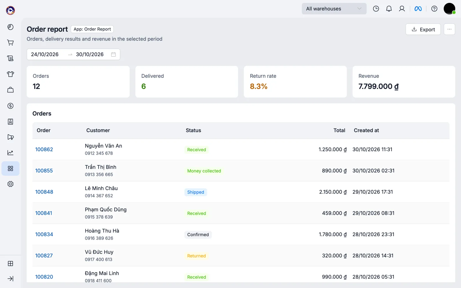
The screenshot is the iframe-report example (get_example in the MCP) with sample data.
Installing
Projects created with create-pos-app already have it. To add it to an existing project:
npm install @pancake-pos/ui @pancake-pos/ui-extensions antd react react-dom
npm install recharts@2 # only when using PosChartPosProvider
Wrap the whole page in PosProvider and get pos with usePos():
import { useState } from 'react';
import { createRoot } from 'react-dom/client';
import { PosFilterBar, PosPage, PosProvider, PosSection, PosTable, PosTextField, PosButton, usePos } from '@pancake-pos/ui';

function App() {
  const pos = usePos();
  const [search, setSearch] = useState('');
  return (
    <PosPage heading="Debts" description={pos.shop.name} actions={<PosButton icon="download" onClick={exportFile}>Export</PosButton>}>
      <PosFilterBar>
        <PosTextField label="Search customers" value={search} onChange={(event) => setSearch(event.detail)} />
      </PosFilterBar>
      <PosSection>
        <PosTable rows={rows} columns={[{ key: 'name', title: 'Customer' }, { key: 'debt', title: 'Owed', format: 'money', align: 'right' }]} />
      </PosSection>
    </PosPage>
  );
}

createRoot(document.getElementById('root')!).render(
  <PosProvider>
    <App />
  </PosProvider>,
);| Property | Default | Meaning |
|---|---|---|
frame |
'plain' |
plain: POS removes the white card around the iframe, the page draws on the gray background and PosSection is a white card. card: keeps the white card; sections get a border |
standalone |
off | A self-hosted page that also opens outside POS: true or { locale, currency } for the language and currency outside POS |
font |
true |
Loads the Inter font shipped with the package (not from Google Fonts: the sandbox CSP blocks external fonts) |
timeout |
10 seconds | How long to wait for POS |
fallback |
Spin |
Shown while waiting for POS |
usePos()returnsposas in the Runtime API; outsidePosProvideror outside POS it throws.usePosOptional()returnsnullinstead.PosPageputsheading,descriptionand the buttons inactions(PosButton,PosMenuButton) on the POS title row throughpos.page.setHeader; clicking one calls that button'sonClick/onSelectin the page. A button needs plain-text children or anicon; other children ofactionscannot go on the title row (the console warns). A page withoutPosPagecan callpos.page.setHeaderitself;PosProviderdoes not overwrite it.- antd strings (DatePicker, Table, Pagination…) follow the user's language: vi, en, th, id, es, pt, lo.
- Apps built with an SDK before 2026.1.11 keep the white card and the old title. With the new SDK the page moves to the gray background; a page that paints its own full-page white background can keep the old look with
<PosProvider frame="card">. On a POS version without title-row support (an older POS),PosPagedraws its title and buttons inside the page and the page keeps the white card.
Components
Write them like Worker UI pos-* elements, with the tag renamed:
| Worker UI | Iframe page |
|---|---|
<pos-stat label="Orders" value={n} /> |
<PosStat label="Orders" value={n} /> |
Events onChange={(e) => set(e.detail)} |
The same: onChange={(e) => set(e.detail)} |
Slots: <pos-button slot="actions">Export</pos-button> |
Properties: actions={<PosButton>Export</PosButton>} (likewise footer of PosModal, PosDrawer) |
The global pos |
const pos = usePos() |
element.focus() through a ref |
ref points at the component's DOM element |
Properties, enum values and limits are listed per element in UI components. Components take value/checked/selected from your state (controlled); leave it out and the component keeps its own value.
| Group | Components |
|---|---|
| Layout | PosStack, PosGrid, PosSection, PosDivider |
| Display | PosText, PosHeading, PosBadge, PosMoney, PosLink, PosImage, PosDescriptionList, PosTimeline |
| Input | PosTextField, PosNumberField, PosSelect, PosCheckbox, PosDatePicker, PosTimePicker, PosDateRange, PosSwitch, PosRadioGroup, PosFileInput |
| Feedback | PosBanner, PosSpinner, PosProgress, PosEmpty |
| Data and actions | PosButton, PosMenuButton, PosTable, PosModal, PosDrawer |
| Pages | PosPage, PosTabs, PosFilterBar, PosStat, PosChart |
PosChartlives in@pancake-pos/ui/chartand needsrecharts:import { PosChart } from '@pancake-pos/ui/chart'.PosMoney,format: 'money'columns andPosStat format="money"follow the shop's currency and rules like POS screens; do not format money withtoLocaleString.- Other antd components (
Tree,Steps…) still work:PosProvideralready applies the POS theme.
Modals and drawers over the whole POS
An iframe page opens modals and drawers in one of two ways:
PosModal, PosDrawer |
pos.ui.modal, pos.ui.drawer |
|
|---|---|---|
| Content | Drawn in the page, uses the page's state | Another iframe page of the app; gets path and query, returns a result through pos.close(result) |
| Size | At most as tall and wide as the iframe; POS dims everything around the iframe | A POS modal or drawer, full screen height |
| Opened from | Iframe pages | Blocks, actions, pages |
| Good for | Confirmations, short forms | Detail panels, wide forms |
PosModal, PosDrawer
A modal or drawer drawn in an iframe can only cover the iframe. While a PosModal or PosDrawer is open, POS dims its title row, menu and top bar around the iframe, as when POS opens its own modal (pos.page.setBackdrop). Clicking the dimmed area or pressing Esc calls onClose of the last one opened, like clicking the mask inside the page.
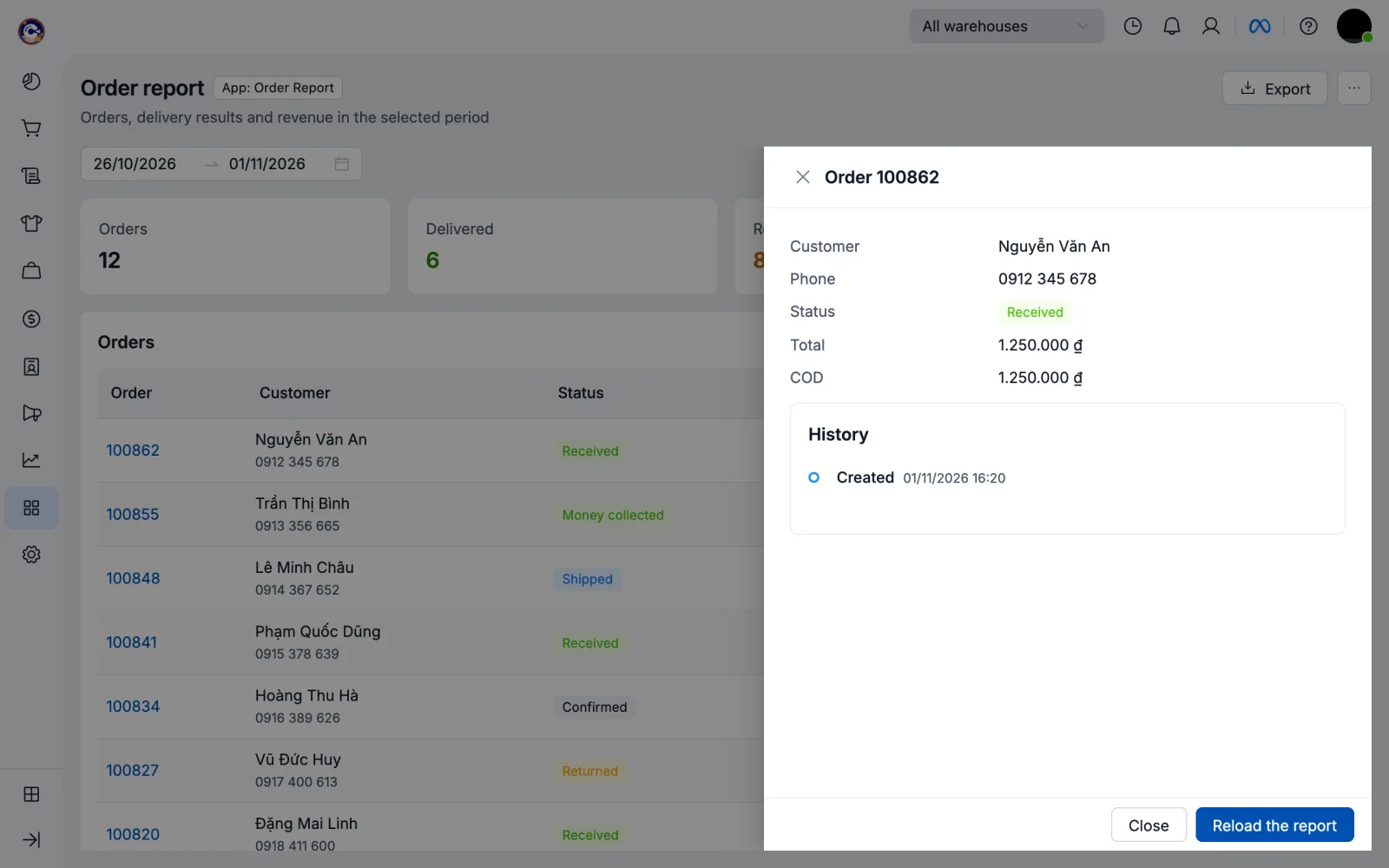
For antd's Modal, Drawer or another library, call usePosBackdrop to get the same dimming:
import { Drawer } from 'antd';
import { usePosBackdrop } from '@pancake-pos/ui';

function Detail({ open, onClose }: { open: boolean; onClose: () => void }) {
  usePosBackdrop(open, onClose);
  return <Drawer open={open} onClose={onClose}>…</Drawer>;
}
This needs the 2026.1.12 packages and a POS version with this command; an older POS only dims inside the iframe, as before.
pos.ui.modal, pos.ui.drawer
A POS modal or drawer (full screen height, also from blocks and actions) opens an iframe page of the app with pos.ui.modal/drawer:
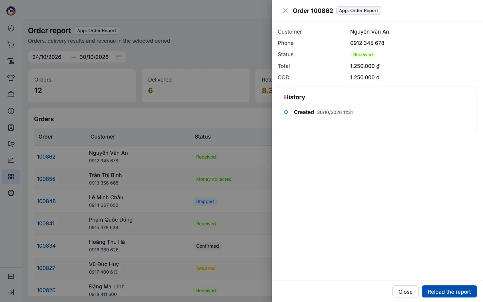
// The open page: open this same page at /pick in a POS drawer.
const picked = await pos.ui.drawer<{ id: number }>({ path: '/pick', title: 'Pick a product', width: 'large' });

// The page at /pick knows it is in a drawer; PosPage buttons sit at the bottom.
function Pick() {
  const pos = usePos();
  return (
    <PosPage actions={<PosButton variant="primary" onClick={() => pos.close({ id: selected })}>Pick</PosButton>}>
      …
    </PosPage>
  );
}
const App = () => (usePos().data.presentation === 'drawer' ? <Pick /> : <Report />);
In a modal or drawer PosPage has no title row (the title is the title passed to pos.ui.modal), the buttons in actions stick to the bottom like a POS modal footer, and a modal follows the content height.
Colors, type, Tailwind
Parts you draw yourself (HTML, your own CSS) use POS tokens instead of hand-picked colors; pos-app check warns about colors outside the POS palette.
import { tokens } from '@pancake-pos/ui';
tokens.color.primary;        // '#0050B3'
tokens.color.bgLayout;       // page background '#EAECF0'
tokens.chart; // chart colors in series order@import '@pancake-pos/ui/tokens.css'; /* CSS variables --pos-color-*, --pos-space-*, --pos-radius-* */
.note { color: var(--pos-color-text-secondary); padding: var(--pos-space-md); }- Tailwind 4:
@import "tailwindcss"; @import "@pancake-pos/ui/tailwind.css";gives classes such asbg-pos-layout,text-pos-secondary,border-pos-border,rounded-pos-card,p-pos-lg,text-pos-body. - Tailwind 3:
import posPreset from '@pancake-pos/ui/tailwind-preset'and addpresets: [posPreset]totailwind.config.js. - Without React:
@pancake-pos/ui/fonts.css(the bundled Inter font) andtokens.css; connect to POS withconnect()(see Runtime API › Iframe pages).
Self-hosted pages opened outside POS
A self-hosted page (url) can also be a standalone web app opened directly in a browser. PosProvider standalone renders it with the same components and the gray background when there is no POS:
<PosProvider standalone={{ locale: 'en', currency: 'VND' }}>
  <App />
</PosProvider>

function App() {
  const pos = usePosOptional();   // null outside POS
  …
}
Outside POS, PosPage draws its title row inside the page with the same style. For the server setup (frame-ancestors, sending the app token to your backend) see Self-hosted pages. Full examples: get_example with iframe-report and self-hosted in the MCP.
Checks
pos-app check and npx eslint . have rules for page/: warnings for other UI libraries (@mui/*, @chakra-ui/*, bootstrap…), colors outside the POS palette, hand-formatted money, a page entry file without PosProvider/connect(), and antd's Modal, Drawer, Modal.confirm (use PosModal/PosDrawer or pos.ui.*); errors for <link>, @import and @font-face pointing outside the bundle.